Kodi Community Forum

Full Version: Horizonz: Future Concept Art
You're currently viewing a stripped down version of our content. View the full version with proper formatting.
Pages: 1 2 3 4
The order of the day is Conceptual. Two months ago I put together a few concept shots of what Horizonz was aiming to become. With Volume III nearing completion and my big move just around the corner, they never saw the light of day, until now that is.

These designs highlight some of the Home Screen features I've implemented over the last few months and clearly illustrates the reason for their inclusion. From day one, my initial intention was to finish Horizonz' feature set prior to improving it's appearance. Too date, I haven't spent too much time tweaking graphics, but after Volume IV is released, I intend to do just that. Bare in mind thought, VIV may still be some way off, for obvious reasons. Also, note, these are psd mockups I made two months ago, so a few ideas may have changed somewhat.

CONCEPT ART

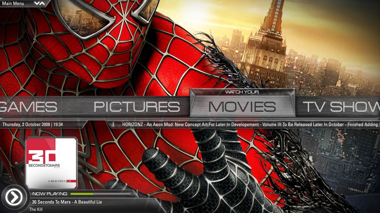
This illustration highlights the DarkShade Home Scroller with revamped Now Playing Music panel, alternative Time panel and RSS Feed panel positions and new Menu Description and Media Section Info panels.
Image

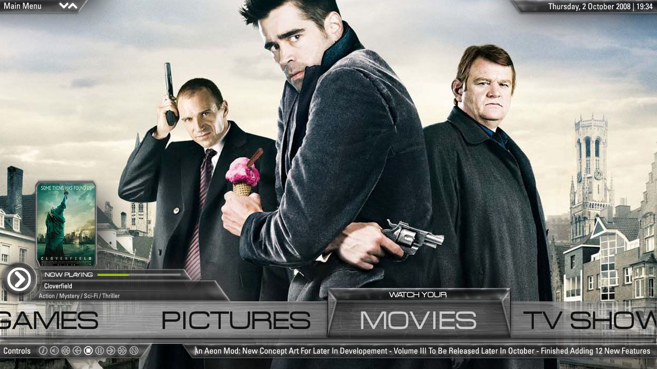
This illustration highlights the Lower LiteShade Home Scroller, with new Now Playing Movie panel, original Time panel position, new Player Control location and also shows how the RSS panel text fades.
Image

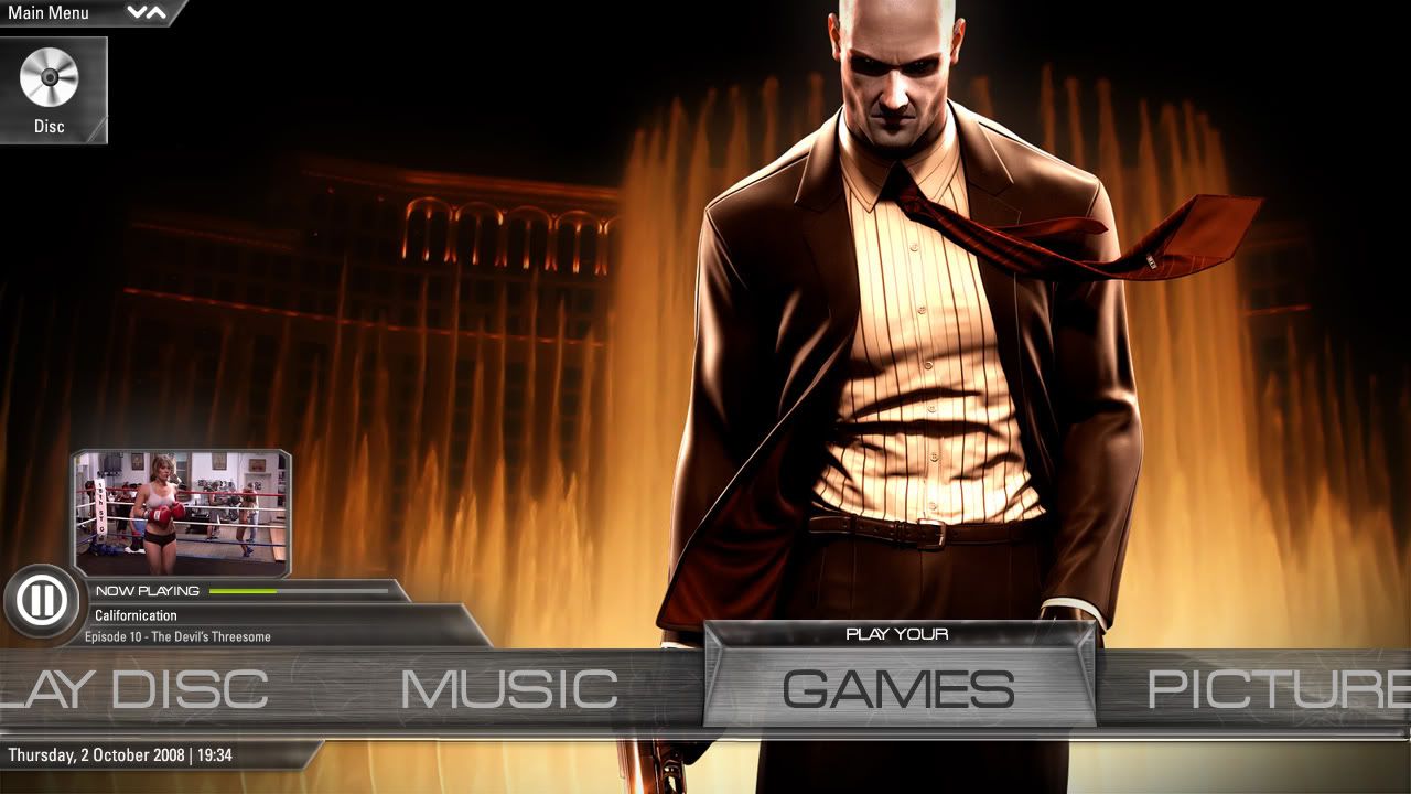
This illustration highlights the new Now Playing Episode panel with a variation in the panel's play state and the new location Disc Popup on disc insertion.
Image

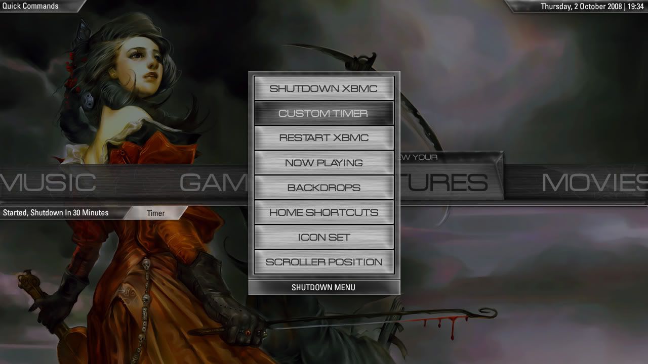
This illustration highlights the Shutdown menu with dimmed background losing focus to Time panel, Section Information panel and all important Dialogs such as Shutdown Timer and Player Controls.
Image

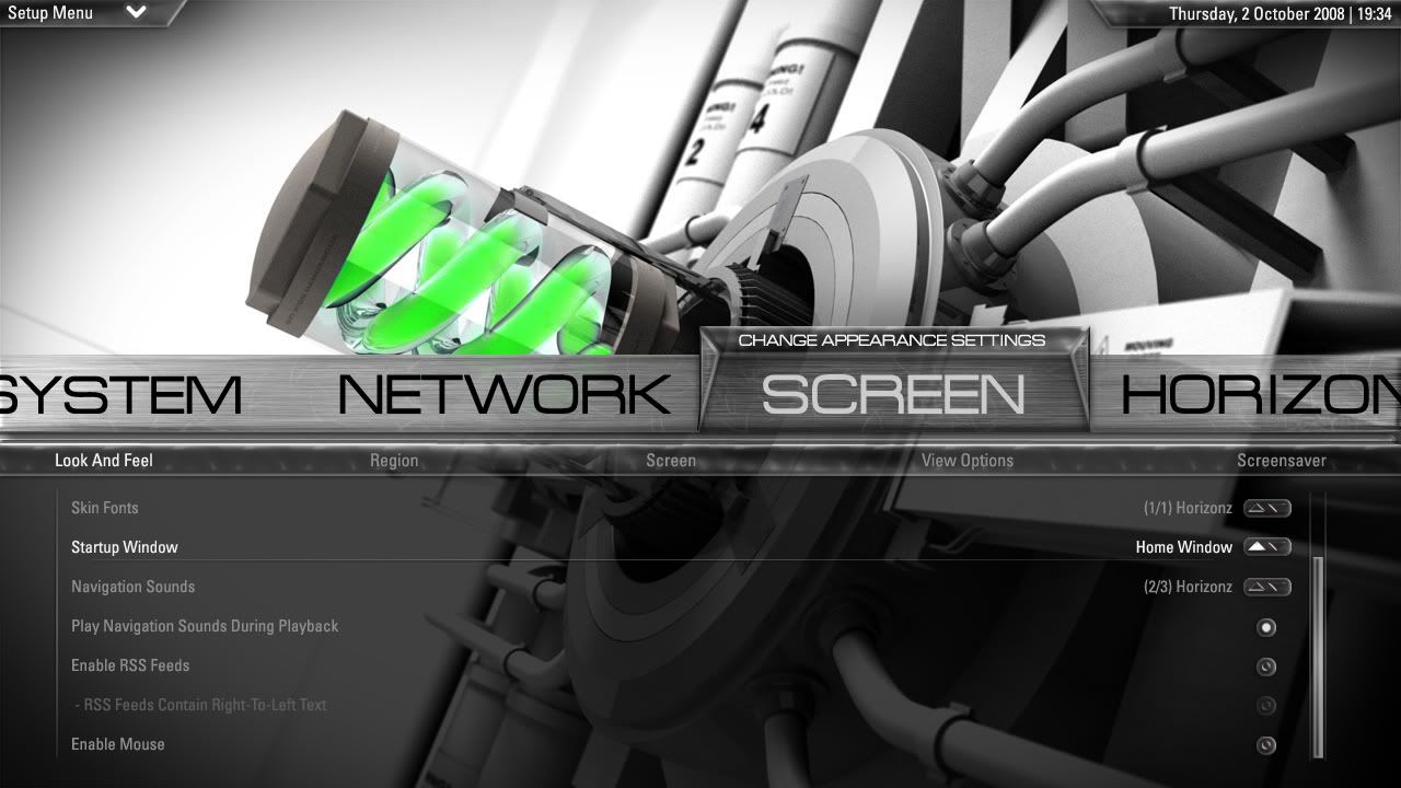
This illustration highlights the Setup Menu categories with new look Category Controls, Scrollbar support and better Item highlighting.
Image

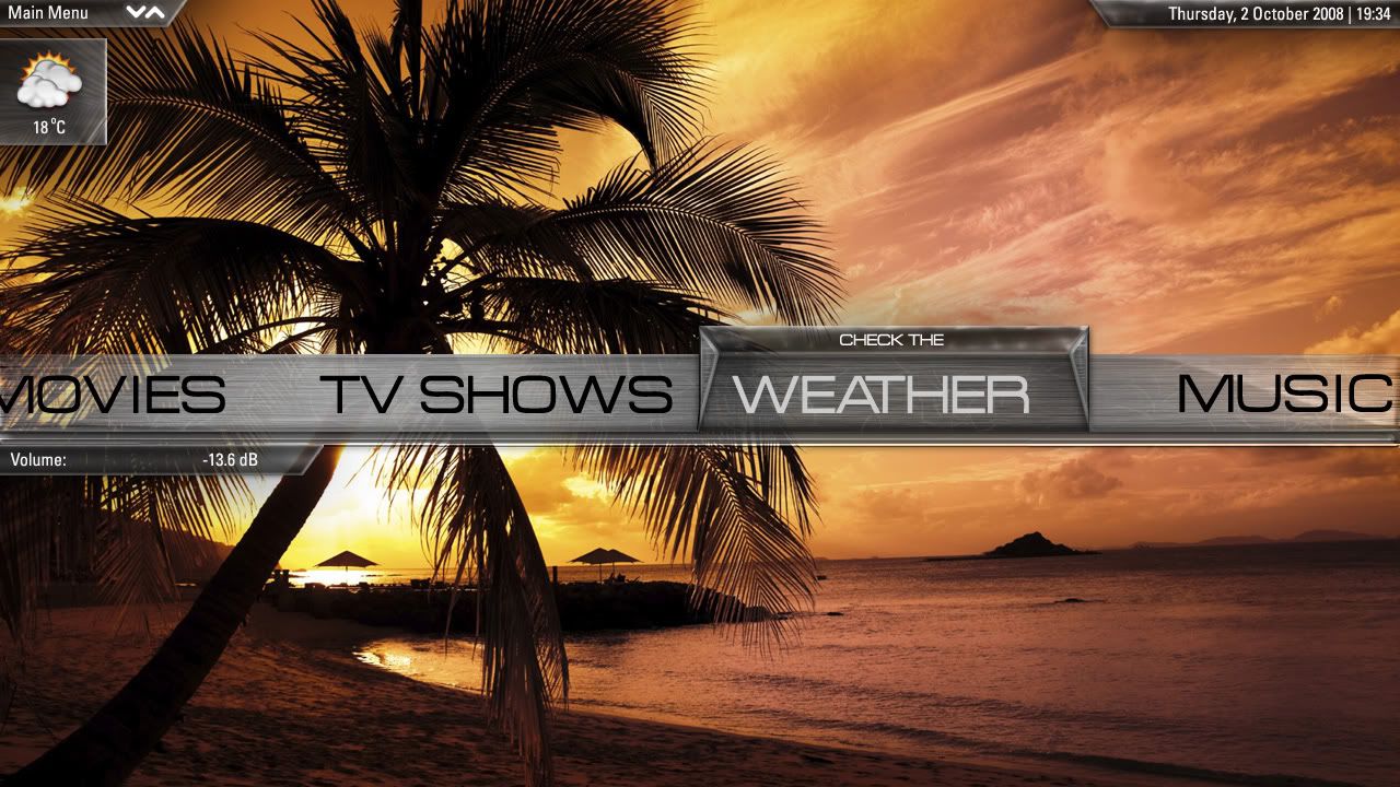
This illustration highlights the new Weather Popup and the new location for all Home Screen dialogs including Volume Control and Mute.
Image

DONATION UPDATE

Don't forget to donate to the PC Fund if you wish. At the moment, $55 is the Target. Yes, thats how well you've supported Horizonz, so thanks for everything. Still attempting to sell a few things in the newspaper, so hopefully, I'll be able to grab a PC asap and finish Volume IV. Here's my PAYPAL details again, if you wish to donate:

[email protected]

Thanks again for all your support! Hopefully I won't miss any of you in the Donation Shouts section in Horizonz itself.

LAST WORD

These concepts are intended for Volume V and beyond. I look forward to hearing what your thoughts on them are, and remember, they are concepts, so constructive comments are only constructive if they're positive in manor. Graphic Design isn't my speciality, so a lot of self-training had to be done in the months leading up to Volume I. It's only been six months since I first used Photoshop and Illustrator. Hope this shows considerable improvement on what I've designed thus far.

Special Thanks to Six_Storm for giving me an idea or two and DigitalHigh for helping with a Backdrop or two.

Hope you like what you see dudes and dudettes, and lets be nice, okay!
Oh my, these mockups are stunning!!! Amazing job XB2IRIS! When did you say these would be in Horizonz.

I've been keeping an eye on Stark, and I must say, these screens look more slick with more functionality! Simply a brilliant job done with the Graphics here! I'm really impressed!
It's a little busy for my own tastes but bravo nonetheless - a very accomplished job that looks entirely within XBMC's abilities. I'm actually glad to see you're taking it in a substantially new direction as the old Aeon really will be succeeded by the new one. Good to see there's life in the old girl yet. Nod

As for the above comment, don't be daft. Wink
Looks good! Little busy like mentioned and the "Play your" thing above the home menu selection is not my cup of tea, but I would love seeing this on my TV.
Glad you shared those screenies... looks very very promising! Really like the "techy" look you gave it... unique design!
I agree... the "play your" bits don't look so good - they're interesting in terms of what is possible, but should not make the final cut. They kinda detract away from what Horizonz should be... DJH is right, it's starting to get a little too busy, and seems like there is no overall design philosophy in mind (this should be: minimal, professional, sleek) - in the same way, the DVD jewels are also on a strange path :/

My 2 cents...
I like everything with 1 exception, the "highlight" on the home menu bar... not sure what it is supposed to represent form-wise but to me it looks a little out of place.

Maybe make the highlight more uniform, like it is a slightly rounded glass (without the hard edged internal reflections - if that is what they are?)

I do like the 'added' explanation of the option once it is highlighted.
missy_xbmc Wrote:Oh my, these mockups are stunning!!! Amazing job XB2IRIS! When did you say these would be in Horizonz.

I've been keeping an eye on Stark, and I must say, these screens look more slick with more functionality! Simply a brilliant job done with the Graphics here! I'm really impressed!

I won't go as far as to say its better than starks screenshots, but it will be wicked... in its own light of course... but thanks for ur comments babes

djh_ Wrote:It's a little busy for my own tastes but bravo nonetheless - a very accomplished job that looks entirely within XBMC's abilities. I'm actually glad to see you're taking it in a substantially new direction as the old Aeon really will be succeeded by the new one. Good to see there's life in the old girl yet. Nod

As for the above comment, don't be daft. Wink

thanks so much man... really appreciate any kinda comment from the skinner of all skinners... especially such a positive one... and trust me, i'll milk the old aeon engine for all its worth... hehehe... everything will be optional, so, it won't end up being all that busy... i totally get u on that point... and i agree... but again, its a pleasure hearing from the legend himself... and i hope one day i'll reach ur level of skinning... maybe u should go on another hiatis, for maybe two or three years, then maybe i'll be as good Smile

krypt2nite Wrote:Looks good! Little busy like mentioned and the "Play your" thing above the home menu selection is not my cup of tea, but I would love seeing this on my TV.

it'd be optional like everything else in horizonz, so it won't be all that busy... u'd be able to customize the bitch to ur prefs... sound good?
dynamix Wrote:Glad you shared those screenies... looks very very promising! Really like the "techy" look you gave it... unique design!

thanks man... trying to do the techy thing, coz all in all, thats the way all interfaces should be... coz their on some kinda technology... hehehe... yeah, i know, that sounds nerdy!

joncgde2 Wrote:I agree... the "play your" bits don't look so good - they're interesting in terms of what is possible, but should not make the final cut. They kinda detract away from what Horizonz should be... DJH is right, it's starting to get a little too busy, and seems like there is no overall design philosophy in mind (this should be: minimal, professional, sleek) - in the same way, the DVD jewels are also on a strange path :/

My 2 cents...

ur two cents are welcome dude... those play your bits will be optional... but i like the idea being in there especially for those who are using the skin for the first time... and with busy being a problem, everything will be optional... so, u can make it as unbusy as u won't... maybe no home scroller as well... then, u can guess what ur doing... hehehe... but for me, coming from a dude, thats been surfing the net for almost 15 years now... professional is a bit boring... i like something out of the ordinary...would u rather where a suit or something that blings u up to max... so, in order for something to look its best, it needs the bling factor... thats my 3 cents... lol... but yeah, the dvd jewels are strange looking, but for a reason... something different or unusual would be cool i'd reckon, but that now playing panel as a whole, still reeks of coolness... but maybe the artwork needs reshaping or something... but we'll see where this heads! that cool u reckon?

Livin Wrote:I like everything with 1 exception, the "highlight" on the home menu bar... not sure what it is supposed to represent form-wise but to me it looks a little out of place.

Maybe make the highlight more uniform, like it is a slightly rounded glass (without the hard edged internal reflections - if that is what they are?)

I do like the 'added' explanation of the option once it is highlighted.

its optional... mostly for people who are new to the system... but i still think it'd be a nice addition... something different... and about rounded glass... kinda leaving the round factor behind... uniformity is the order of the day, and i reckon, panels across the skin will look similar to the way it is in the above pics... thanks for your comments... greatly appreciated!
Thanks for that donation jarod71 and the great pm... and thanks for all the comments u guys... much appreciated... remember, this is a draft, so ur comments mean a lot in terms of the final product in volume V... so keep 'em coming dudes!
xb2iris Wrote:The order of the day is Conceptual. Two months ago I put together a few concept shots of what Horizonz was aiming to become. With Volume III nearing completion and my big move just around the corner, they never saw the light of day, until now that is.

These designs highlight some of the Home Screen features I've implemented over the last few months and clearly illustrates the reason for their inclusion. From day one, my initial intention was to finish Horizonz' feature set prior to improving it's appearance. Too date, I haven't spent too much time tweaking graphics, but after Volume IV is released, I intend to do just that. Bare in mind thought, VIV may still be some way off, for obvious reasons. Also, note, these are psd mockups I made two months ago, so a few ideas may have changed somewhat.

CONCEPT ART

This illustration highlights the DarkShade Home Scroller with revamped Now Playing Music panel, alternative Time panel and RSS Feed panel positions and new Menu Description and Media Section Info panels.


This illustration highlights the Lower LiteShade Home Scroller, with new Now Playing Movie panel, original Time panel position, new Player Control location and also shows how the RSS panel text fades.


This illustration highlights the new Now Playing Episode panel with a variation in the panel's play state and the new location Disc Popup on disc insertion.


This illustration highlights the Shutdown menu with dimmed background losing focus to Time panel, Section Information panel and all important Dialogs such as Shutdown Timer and Player Controls.


This illustration highlights the Setup Menu categories with new look Category Controls, Scrollbar support and better Item highlighting.


This illustration highlights the new Weather Popup and the new location for all Home Screen dialogs including Volume Control and Mute.


DONATION UPDATE

Don't forget to donate to the PC Fund if you wish. At the moment, $55 is the Target. Yes, thats how well you've supported Horizonz, so thanks for everything. Still attempting to sell a few things in the newspaper, so hopefully, I'll be able to grab a PC asap and finish Volume IV. Here's my PAYPAL details again, if you wish to donate:

[email protected]

Thanks again for all your support! Hopefully I won't miss any of you in the Donation Shouts section in Horizonz itself.

LAST WORD

These concepts are intended for Volume V and beyond. I look forward to hearing what your thoughts on them are, and remember, they are concepts, so constructive comments are only constructive if they're positive in manor. Graphic Design isn't my speciality, so a lot of self-training had to be done in the months leading up to Volume I. It's only been six months since I first used Photoshop and Illustrator. Hope this shows considerable improvement on what I've designed thus far.

Special Thanks to Six_Storm for giving me an idea or two and DigitalHigh for helping with a Backdrop or two.

Hope you like what you see dudes and dudettes, and lets be nice, okay!

Nice to see your online. Anyways, I don't know what to say about these new Screenshots! They're absolutely stunning first of all, and I like everything you've done with them. Agree with a the one dude about the dvd cover, its a bit oblong, but i guess thats okay, but this is something special!

Not bad for a photoshop baby! I'm amazed at how you've improved dude! I think the final product will be revolutionary! I for one am super excited!
BlackRose Wrote:Nice to see your online. Anyways, I don't know what to say about these new Screenshots! They're absolutely stunning first of all, and I like everything you've done with them. Agree with a the one dude about the dvd cover, its a bit oblong, but i guess thats okay, but this is something special!

Not bad for a photoshop baby! I'm amazed at how you've improved dude! I think the final product will be revolutionary! I for one am super excited!

thanks babes... especially like the part where ur insulting anyone and not picking a fight... very special times... hehehe...

nyways... close to xmas and no pc yet, so keep the faith, a dude donated over the w-end, so maybe others will chip in with the odd xmas donation... hehehe!
Hey, great to see you finally posted these! Said you should a long time ago, but yeah, your a stubborn one. They look great man, better on my pc than yours i take it, i remember the pics being darker somewhat! Nonetheless, their a work of genius and I look forward to the day they're actually in Horizonz!

Anyways, donate people, XB2IRIS only needs a few bucks, then a Volume IV will be here for all to enjoy! Tested it the other day, and their are some neat new features and a lot of the things he's posted as screenshots actually look a hell of a lot better than you'd think when you actually get to see them in person! But yeah, its almost finish, but isn't at all stable. Some of the other stuff that used to work doesn't anymore, so trust me, he's not holding out on you guys but I reckon it'd take a full 3 or so days to finish it, but thats a guess, coz a lot of stuff isn't finish!

I've donated, your turn if you haven't already!
are you planning on separating all settings menus from the movies, weather etc menus?
Like the brushed metal look...definitely crispy. Could be just a*tad* less pronounced in the OSD menus and stuff. Keep the metal, just make the transparency higher. (Fourth Picture down)

And actually, looking at that same pic again, I think the whole thing would look really sharp if it were just a bit more transparent. I really like the glasslike feel this adds tho.

And I have to agree...the "Play Your" thing above videos, and "adjust the" above settings...it's a bit too much like mediastream. Or maybe it's because it is too busy or something. What if you had that text appear at the top center or top right of the screen? Keep it in there because extra descriptiveness is always good, but don't have all that stuff interacting in one spot?

I like the new "now playing" stuff you did tho...fits very nicely with the rest of the skin.

Have you given any thought to having the weather display with the main bar somehow? Add the option to have it on top or right on the main scroller or something...
Pages: 1 2 3 4