+- Kodi Community Forum (https://forum.kodi.tv)
+-- Forum: Support (https://forum.kodi.tv/forumdisplay.php?fid=33)
+--- Forum: Meta-Data provider and Artwork Packs (https://forum.kodi.tv/forumdisplay.php?fid=71)
+--- Thread: "ClearArt" concept - overlay type artwork for ex. 'episode poster/fanart on paused' (/showthread.php?tid=51705)
- Imaginos - 2009-07-04
Yes it's a good start, but it can be enhanced if you want

1st, the size of the png should be 500x281
2nd, we finally noticed that the final render is better when the picture isn't cut on top or on the left because it may look strange on screen
3rd, there is some work to do with the hair
But keep on, you're on the right way my friend !
edit : I'm not a fan of this show, but try this one :

- reaven - 2009-07-05
gallery updated it
- reaven - 2009-07-08
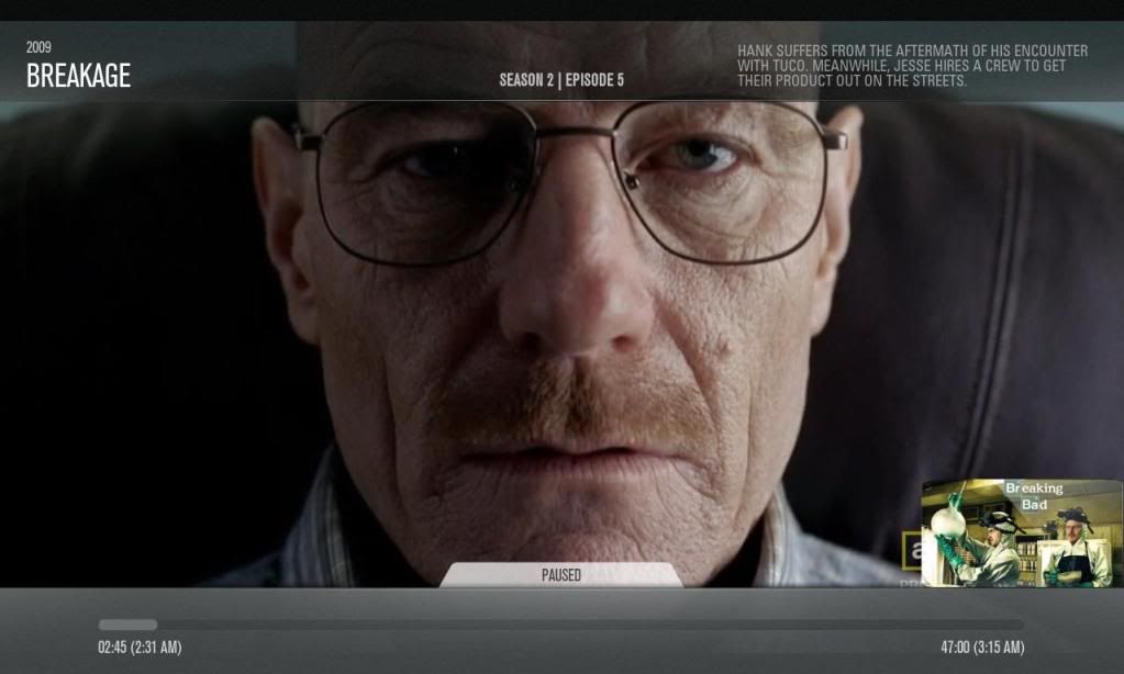
since I cant decide I will ask. i want to put season and episode number but dont knwo where to add it.
I was thinking next to the episode title or put another tab like the one where the title is but on the other side where the clearArt is, what do you think.
I want to add this now since I discover it can be possible because there's nothing on the wiki about this $Info label.
- reaven - 2009-07-08
working sample

- Imaginos - 2009-07-08
the numbers and titles are displayed underneath the progress bar in my mod, so i don't have any idea
- reaven - 2009-07-08
Imaginos Wrote:the numbers and titles are displayed underneath the progress bar in my mod, so i don't have any idea
I know how to deal with that but before I wanna know a good position to put the info.
- reaven - 2009-07-08
mhh!
- Imaginos - 2009-07-08
yes too much, the episode thumb is superfluous IMO.
you could try to leave the clearart at it's place the numbers and title in the black bar on the upper left of the progress bar, then the plot on top left or top middle
- FernFerret - 2009-07-08
I dunno, I kinda like it, it would be sweet as an option! I'd use it, not sure others would though...
Great work btw!
--FF
- reaven - 2009-07-08
more tests.
- mcborzu - 2009-07-08
I vote Test3...I lie having clearart over the video, more in the way networks do it.
- Batemann - 2009-07-08
I Love it. The Second one. Defin! :-) First one is too much, second one is too little. ;-) Release it!
- FernFerret - 2009-07-08
test2
I LOVE this one. Perfect.
--FF
- reaven - 2009-07-08
what do you think ?
test1

test2

test 3

test4

- Imaginos - 2009-07-08
Test 3 is my favorite
I think the "paused" tab MUST stay sticked to the progress bar, it is it's logical position