• 1
  • 12
  • 13
  • 14(current)
  • 15
  • 16
  • 117
[RELEASE CANDIDATE] Aeon Nox 3.0
Navigation is fixed now, was indeed a bug.
The music panel was problematic. What I wanted was to show fanart and fallback to thumb. Unfortunately, if theres no fanart it doesn't report empty somehow and thus it won't fallback to thumb. Since scanning music wont automatically add fanart for most artists (at least on my machine/music) I decided to show the thumb instead, scaled to center.
If I'm the only one with messed up fanart I can change it to show fanart instead.
The text is not supposed to be too visible. If you really wanna know what it says people can stand a bit closer to the tv imo. I'm guessing people only want to read it the first couple of times.

EDIT: I know setting the option to download additional info can solve teh fanart problem for most part, but that one is set to false by default and a whole bunch of people never find that option.
I follow what you're saying and you are right about the labels. Read it a couple times, and you know which is which.

Far as fanart, think using the thumb is a better default choice. Even with artwork downloader or the option to download additional info, not all artists have fanart made for them. Usually at least the thumbs exist for the albums. And since they are square it also makes sense to scale to center.

The center square for the music panel. Not sure what it is, random song, most popular? Seems only 1 in the 5 have a thumb showing and I know I have a thumb for all the albums it's showing. Also, when I hit OK on them, it's not doing anything. Be kinda neat if you could add music addons to it like the TV and Movie panels. Easy way to get to your online music services.

When I hit OK on either a Featured or Latest panel, the music starts playing (as you'd expect). However, the panel goes away, and I guess it's supposed to start up the Now Playing widget. What's happening tho, it seems to lose focus, all I see is the Main Menu, but you can't navigate anywhere. You have to either hit DOWN, BACK or ESCAPE and then you get the Now Playing Widget to display and navigation works again.

Last thing, can the Main Menu navigation tip display a UP Arrow when the panel is in use? Helps people know how to get to it. I had some novices trying it out earlier and was watching them trying to hit Down twice, once for sub-menu another to go to panel like the Featured and Latest widgets. Then they tried hitting back, and Home and lots of buttons until I told them "Hit Up". So thinking just a tip that shows UP Arrow (Navigate/Panel) would be helpful there.

Sorry if I seem to be fixated on the panels. They're just one of my favorite new things you guys put in Smile I should probably go about the rest of the skin looking for thingsRolleyes
I'm glad you like the panel Big Grin
The middle albums are the top 5 most played albums. Reason for that is because I like that and because I can never find 5 music addons to fill the screen. Maybe I can find a way to customize the panel.
I see the problem with the playing music and the middle one does not work at all. Will fix that later tonight.
Awesome. Yes, those panels work so well for the Home Screen, really dig them. Lots of information and not taking up all that much room. Plus them being animated like the Featured windows makes the home screen more interesting.

What about adding favorites to the center panel? That way you could choose a playlist, or a particular radio station from shoutcast, or music video list. Just ideas I thought I'd use it for.

Now, onto something else other than panels Big Grin
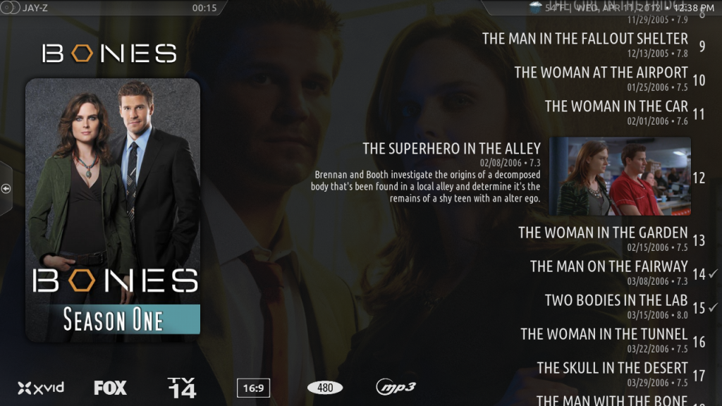
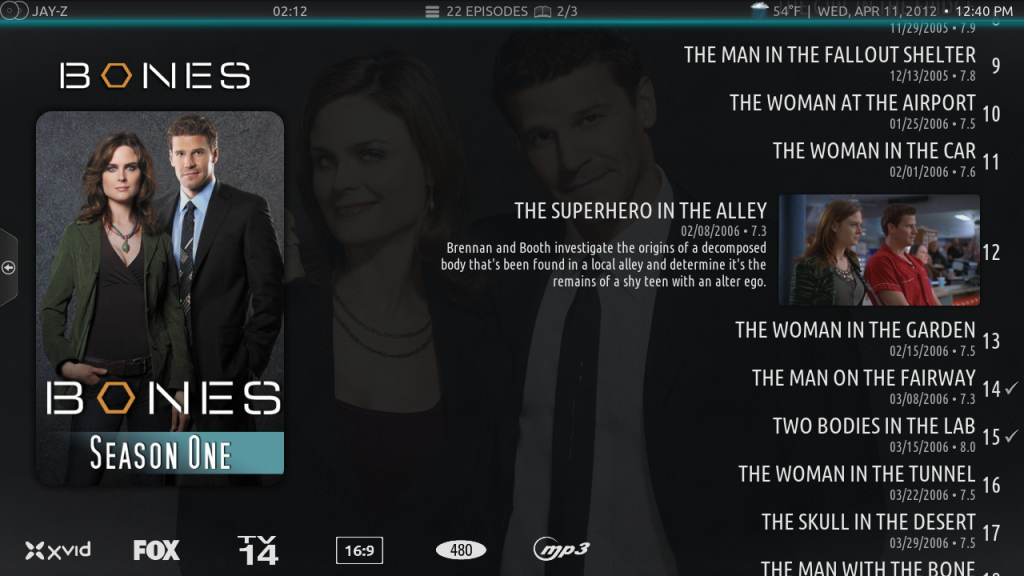
Regarding the Episode view. Not sure if you and Phil are done with it, but here's something I found and think it was mentioned before a few pages back.

The top of the list goes underneath the breadcrumbs. With the bar set as "Breadcrumbs Classic" this is not a problem. The episode title goes underneath the bar and you barely notice it. If you change the top bar style to "Default Breadcrumbs" or "Classic Top Panels", the episode text still goes underneath. But since the top bar is now transparent you can't really read the date, time, weather etc. Since it's lost with the episode text.

Here's a quick screen shot using the "Classic Top Panels" option (same with Default Breadcrumbs).
Image

And another shot using "Breadcrumbs Classic" where you can still see the crumb info
Image

Having the bottom of the list slightly cutoff is actually useful. Indicates there is more to scroll through, very intuitive. Perhaps the top of the list could cut off where episode 9 is in my screenshots? Still allows you to see 3 previous episodes, your current selection, and the next 6.

Edit: This view is probably still being worked on, so if this is already known, apologies for bringing it up again Smile
fixed.
Donate: https://kodi.tv/contribute/donate (foundation), 146Gr48FqHM7TPB9q33HHv6uWpgQqdz1yk (BTC personal)
Estuary: Kodis new default skin - ExtendedInfo Script - KodiDevKit
I too have to give a big thumbs up to what you guys have accomplished. this skin is great!!

i really like all the new options.

concerning the home screen music panel: would it be possible to add an album option to the featured/random music side? or maybe an option to play the entire album the song is on (like a pop-up asking if you want to 'play song' or 'play album')? for the middle section i could also see most played albums instead of songs (just my personal taste, as i usually listen to entire albums)

other than that, the only thing i've noticed is the occasional crash when switching layouts in showcase view. after a restart the chosen layout is displayed with no problems.

keep up the good work
Don't you love when you fix one thing and it causes something else to go wonky?

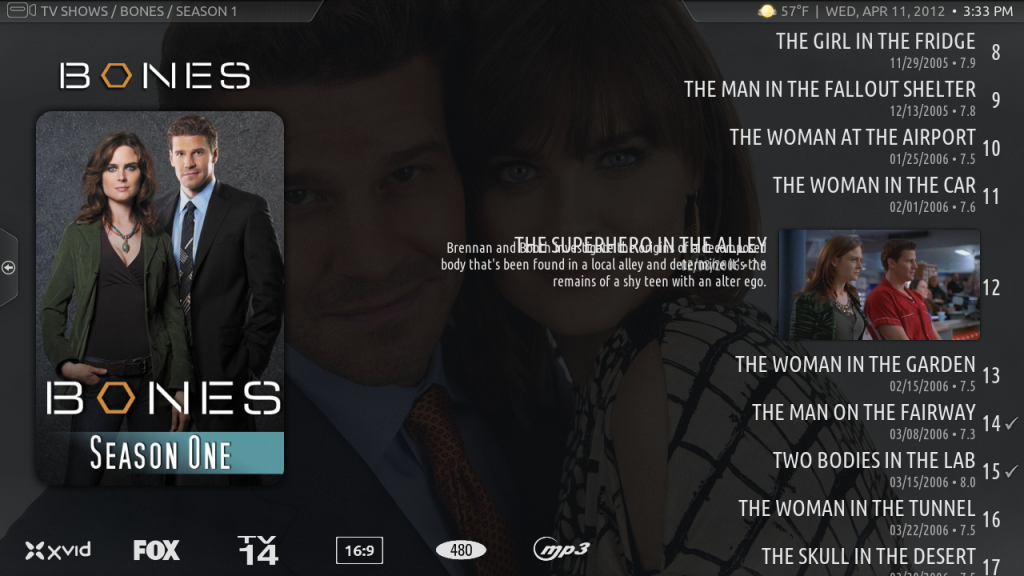
Episode title for the one currently focused is overlapping with the episode description.
Image

Good news tho, it's not overlapping with the top panel anymore Big Grin
(2012-04-12, 00:36)Rygrath Wrote: Don't you love when you fix one thing and it causes something else to go wonky?

Episode title for the one currently focused is overlapping with the episode description.
Image

Good news tho, it's not overlapping with the top panel anymore Big Grin

try again.
Donate: https://kodi.tv/contribute/donate (foundation), 146Gr48FqHM7TPB9q33HHv6uWpgQqdz1yk (BTC personal)
Estuary: Kodis new default skin - ExtendedInfo Script - KodiDevKit
Perfect!
For the episode view (one of my fav's btw) would it be make sense to reduce the dim of the fanart? Let it be a bit brighter?

But I realize that would make the test less readable if it were white, but red or a dark grey text would probably look pretty cool
sorry, stupid question - how do I disable the animated backgrounds on the home menu? Im sure its right in my face but I cant seem to find it...
Latest GiT update has done this.
Under Viewtype Settings change Background1 to Background2
(2012-04-12, 05:02)Rygrath Wrote: Latest GiT update has done this.
Under Viewtype Settings change Background1 to Background2

UNFREAKINGBELIEVEABLE!!! Im LOVING this!!!
(2012-04-12, 05:01)noner Wrote: sorry, stupid question - how do I disable the animated backgrounds on the home menu? Im sure its right in my face but I cant seem to find it...

no, not there atm because of the settings shifting. will return.
(2012-04-12, 05:08)noner Wrote:
(2012-04-12, 05:02)Rygrath Wrote: Latest GiT update has done this.
Under Viewtype Settings change Background1 to Background2

UNFREAKINGBELIEVEABLE!!! Im LOVING this!!!

Could only test it on a bad monitor will adjust the brightness when needed. will make it color the title now when the color labels option is enabled.
Donate: https://kodi.tv/contribute/donate (foundation), 146Gr48FqHM7TPB9q33HHv6uWpgQqdz1yk (BTC personal)
Estuary: Kodis new default skin - ExtendedInfo Script - KodiDevKit
Just something I noticed. In episode view, I have the area color set to red and the color labels set on. The glowbar switches color but the labels are still the same.

Image

But if I activate the context menu, just the episode number switches color (the rest stays white)

Image

Exiting the context menu returns the episode number to white

The logo above the poster looks great BTW, just wish I could get rid of the poster completely (but you have heard me say that lots Smile)
Also, scrolling between episodes, the watched indicator check mark dissimilar for the active episode but this may be intentional, comes right back when its no longer highlighted. In the pics above, ep 21 should have the watched indicator as well
  • 1
  • 12
  • 13
  • 14(current)
  • 15
  • 16
  • 117

Logout Mark Read Team Forum Stats Members Help
[RELEASE CANDIDATE] Aeon Nox 3.07