WIP Essence
#16
(2012-10-24, 17:54)protocol77 Wrote: this looks like especially with that blue spot background like it could be a new version of confluenceSmile

Thanks! It is based on Confluence so there is some heavy similarities until I've come around and redone them the way I want them to. Smile

(2012-10-24, 20:24)Vaikin Wrote: Scrolling between latest 'x' amount of movies seems better. But if you want to keep it very simple, just use 3.

I would prefer latest 5-10 movies.

Looks great btw!

Thanks, glad you like it so far! I will have two version of it, one more like confluence where you can scroll between a bigger set of movies/shows and one like the mockups.

(2012-10-25, 11:04)Sabish Wrote: Good work ... btw, i'd stick with this font instead of the one you used in your mockups : much better IMO !

Yeah, I tested it with the same font used in the mockups and it was just not readable at all from the couch. So I'm currently using the same fonts as Aeon.Nox since I think those work really well.

Got a few new screenshots going as well:

Playing around a bit with the location of the main menu and the Now Playing controls, I kind-of like it when it's closer to the bottom.
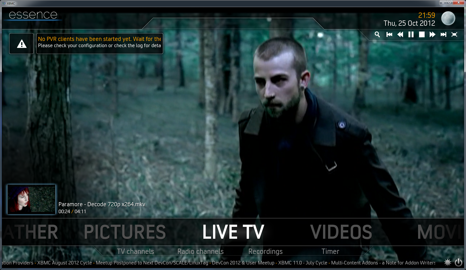
Image

Ignore the stretching of the Posters, my test-setup is not properly setup, works fine on my "production" HTPC though.
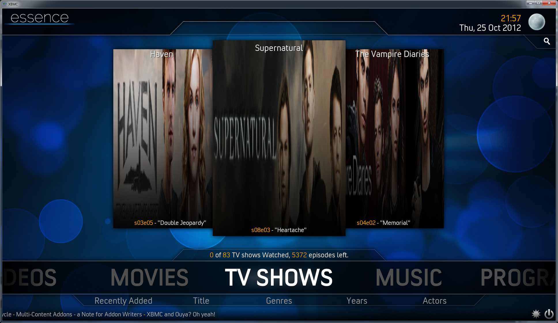
Image

The currently selected movie or show is highlighted with the blueglow and the "play" icon, animation wise the side posters slides out from the centeral poster when you first go over the movies or tv-shows buttons.
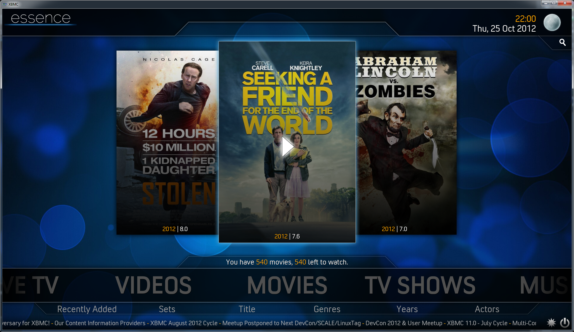
Image

I'm considering upping the amount show from 3 to 5 items instead, might do a test and see how I like that, there is a lot of space on the sides that could be used for something nice. Smile
Reply
#17
You could hide some items and just show 3 at a time I think.
Reply
#18
(2012-10-26, 18:39)Balinus Wrote: You could hide some items and just show 3 at a time I think.

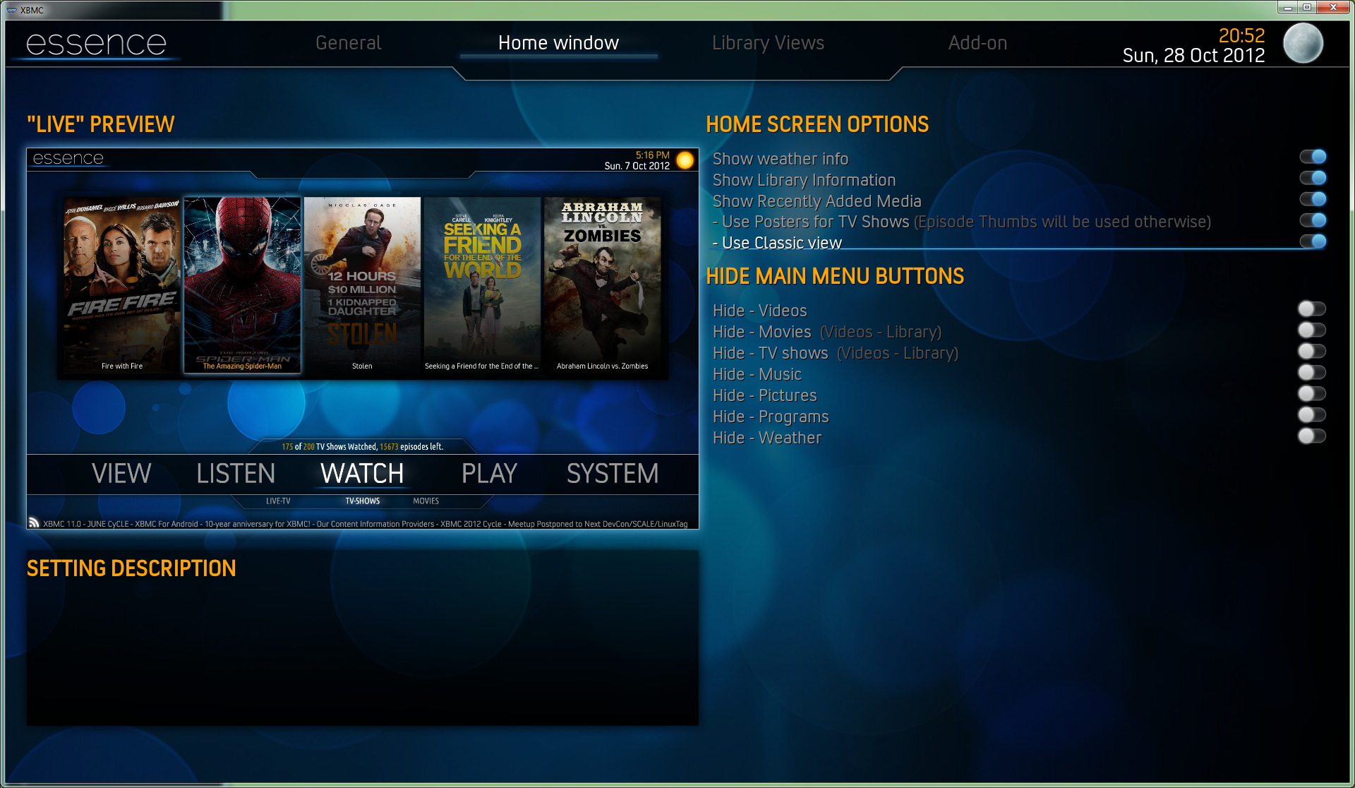
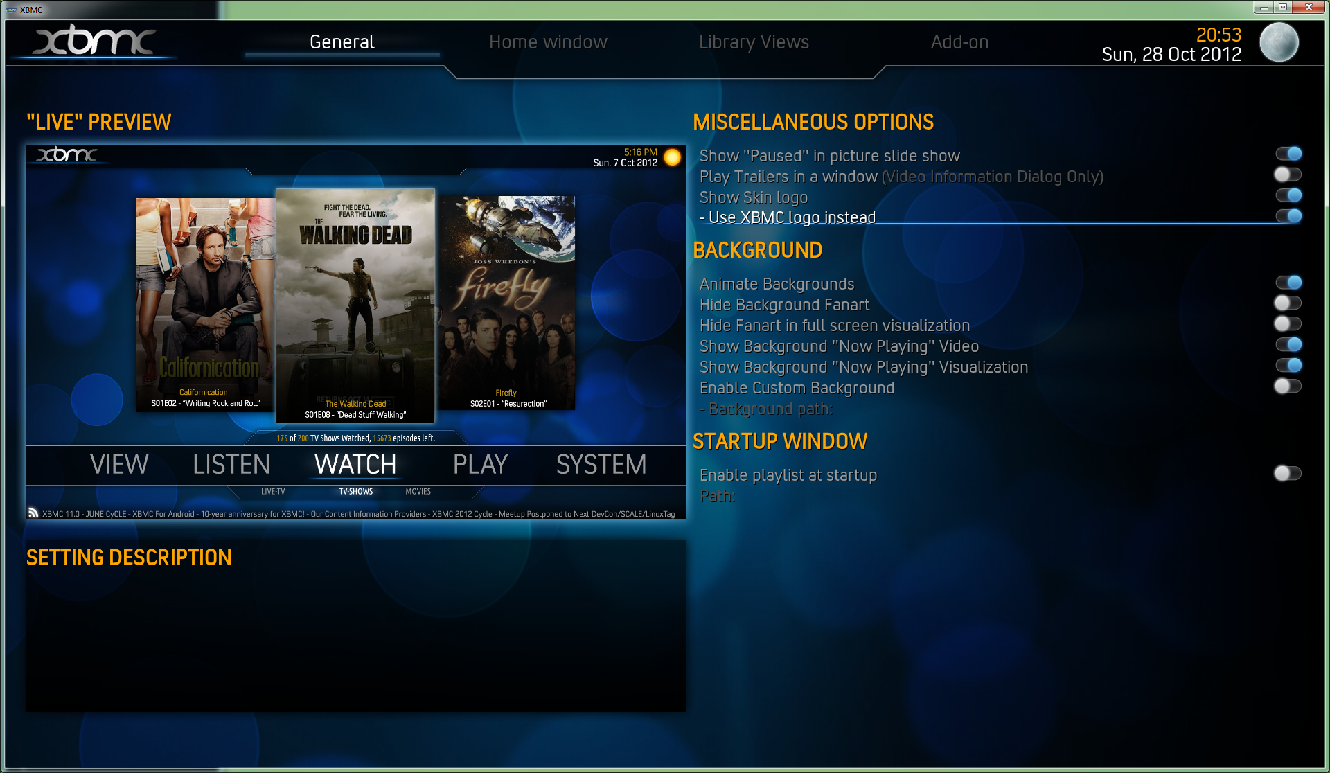
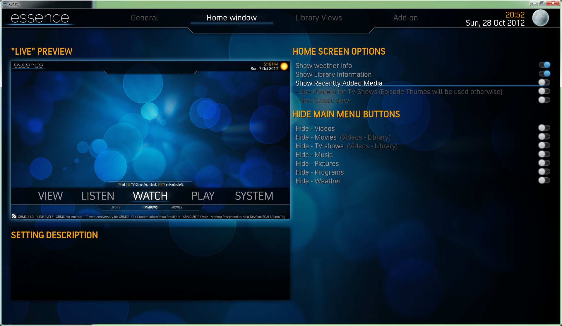
Yeah, I will see how it feels. I made an quick update on the Confluence style and added that as an "classic" option in the skin for now, will take a better look at it later one. Been mostly working on the skin configuration and updating elements in the skin. For each setting that effects the homescreen the "live" preview will display that change as you toggle it, the same kind of preview will be done for the other configuration tabs as well. It's working pretty good but it's a bit of a resource hog since I havn't downsized the images that it uses yet.

Screenshots of the Skin Configuration (The rest of the settings will be using a similar design)
Image
Image
Image

Cheers!
Reply
#19
So a little progress update:
I've spent the past time on the skin, fixing dialogs and fixing bugs related to the homescreen and so on. The skin is starting to get usable now though many things are still left to do, might looking for a tester or two in a few weeks time if anyone is interested.

I've been playing around with a few concepts for the media views and starting coding them too, currently I only have a simple listview and thumbnail view done to learn the structure of those files/includes. Ill post a few mockups later today or in a few days when they are complete and updated screenshots.

Cheers
Reply
#20
(2012-10-26, 06:19)orecus Wrote: I'm considering upping the amount show from 3 to 5 items instead, might do a test and see how I like that, there is a lot of space on the sides that could be used for something nice. Smile
IMHO there is no need to fill all the screen space with... something. Leave it with three visible and scrollable up to 5 or 10. Additional it look a lot better if you make the thumbs a little smaller and if you want... necessarily to fill the empty space you can show the fanart for each item.

Cheers
Nessus
Reply
#21
Save yourself some time:
System -> Settings -> Debugging -> screenshots folder
...
Hit [prt sc] button on keyboard.
Image [RELEASE] Metroid
Image [RELEASE] IrcChat
Reply
#22
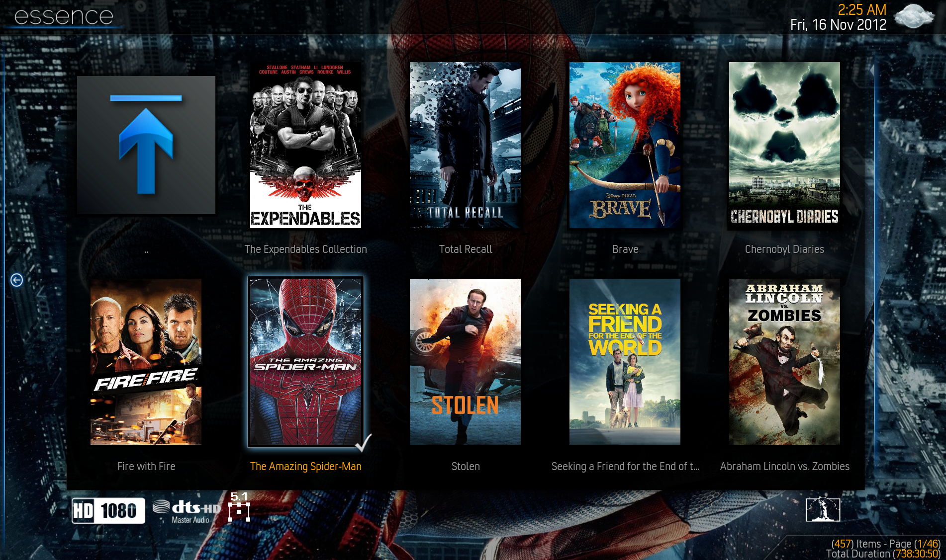
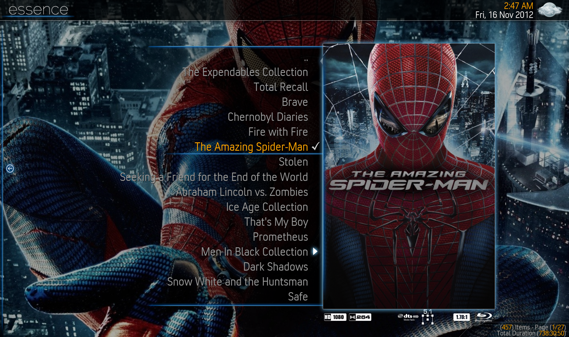
Below are a few new screenshots of the current progress, spent quite some time fixing and redoing animations all over the skin, much better and smoother feel to it now. I've also tweaked/fixed a really simple and basic listview and thumbview to the skin now, I will expand with more "custom" views in the next updates and tweak these so they look good regardless of what you are browsing. Currently it's more Poster friendly and just strecthes thumbs, will take care of that soon.

Image
Image

(2012-11-12, 10:42)nessus Wrote: IMHO there is no need to fill all the screen space with... something. Leave it with three visible and scrollable up to 5 or 10. Additional it look a lot better if you make the thumbs a little smaller and if you want... necessarily to fill the empty space you can show the fanart for each item.

Cheers
Nessus

Thanks for the input Nessus, I will consider your points when I go back and revisit those areas, currently working on the media views. I really do appriciate your input!

(2012-11-12, 12:45)MassIV Wrote: Save yourself some time:
System -> Settings -> Debugging -> screenshots folder
...
Hit [prt sc] button on keyboard.

How could I have missed that!? Thanks for the tip!
Reply
#23
Please include Lithuanian language pack to Essence Skin
Lithuanian language, Baltic font, Baltic fonts
Thanks
Reply

Logout Mark Read Team Forum Stats Members Help
Essence0