icons
#1
Just saw these... might be good as settings icons. I'm adding them to my version. but not sure but thought I would share. What do people think of them?

http://icons.mysitemyway.com/category/ma...are-icons/

also looks like its legal usage too. check bottom right of the link.


or here for more

http://icons.mysitemyway.com/new-icons/
Reply
#2
fullfatcream Wrote:Just saw these... might be good as settings icons. I'm adding them to my version. but not sure but thought I would share. What do people think of them?

http://icons.mysitemyway.com/category/ma...are-icons/

also looks like its legal usage too. check bottom right of the link.


or here for more

http://icons.mysitemyway.com/new-icons/

Very nice, bookmarked for future use, thanks !
ynwa
Reply
#3
These look great, I can well imagine the white ones looking nice with red icons on them (like the ones currently in the settings screen).

the boxes Alaska currently uses seem to have a drop shadow around them, its nice, I wonder how the homescreen would look with the apple-esque bottom shadow under them instead?

Im gonna turn these icons red and try to make this happen, (its a bit rough around the edges, but I was using an online image editor as I dont have photoshop right now), and Ive only used Arial as I dont know the Alaska font.
Image

EDIT:
Just came across a font which I think would be really nice for Alaska, can anyone identify it?
in the icon, below:
Image
Reply
#4
I for one like to keep things simple. I think the icons do provide that. I did the same thing last month accept in a darker tone. I thought it turned out pretty nice.

Image
HTPC: Apex MI-008 | Foxconn H67S | Celeron G530 | G.SKILL 4GB | Crucial 64 SSD| Arctic Cooling | PicoPSU-160-XT
Reply
#5
I didn't even think of putting them on the home menu.

I went for them here...

http://img146.imageshack.us/i/screenshot...at191.png/
Reply
#6
Star 
I guess there's not much interest in this minor mod of the home menu.

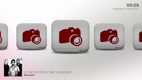
I'm gonna continue anyway just to learn a few things. Installed gimp and messed made some edits to the icons, replaced frame.png with a new (temp) graphic. All homescreen items look the same at the mo, just wanted to see how it would come out.
Image

Some mistakes to correct (leftside of dropshadow is cut-off, text alignment is out). Decided just to stretch the icons to the original width of the graphic in frame.png. I guess I could have kept them square but for now, this was just to see how the text would align. I also learnt of the many separate pngs which sit on top one another to make up the icons. Just to test, I moved all bar the frame.png from the folder but there still appears to be some shading going on over the icon as it wasn't this dark in gimp. Also, to block out the bkgrnd images (streaming blue lasers (music), theatre image (movies)), I've used a transparent PNG of 50x50px and set alaska to show the png as artwork for each of the sections. (cack-handed).

Anyone have tips/reasons why the fading is going on, further, anyone know how to re-align the text which sits underneath the icons? (If I can do that, I might as well keep the icons square, meaning I don't have to stretch and lose the aspect ratio of the graphic).

Progress is crushingly slow, so mostly I have learnt- dont set out to do this armed only with a dinovo mini! Laugh (must get my laptop fixed).

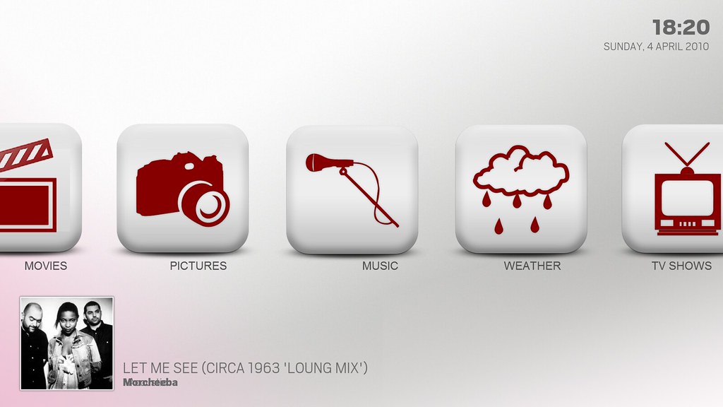
EDIT: just one more thing: my text displaying the album name hides behind the artist name. Anyone know which xml governs alignment.
Reply

Logout Mark Read Team Forum Stats Members Help
icons0