[WIP] [THEME] Caelatum (Embossed Brushed Steel)
#16
New versions of .xbt file and .xml file in the first link:

Update 27-Jan:

  • Added all the Default Icons to .xbt
  • Changes to round corner mattes and frames to square corners
  • Changes to some of the reflection masks
  • Small changes to colors (mostly just changing them to shades of black or white)

Still to do:

Genre icons and more frame fixes

Please feel free to look it over and let me know where there are problems with the Theme.
Image
Reply
#17
A couple of things,

@Hitcher - I noticed that on 1920x1080 screen that the DefaultIcons scale up. I had thought that making them 256x256 would be sufficient, but do they also need to be 420x450?

@Juanflaco - I am really struggling with the icons background, every time I change it from the angle gradient fill I change it right back because I just don't like what I see. I am including a link to one of my .PSD files to let you play with it, if you like, and see if there is something better. I will gladly change them all if there is a better look achieved.

Square xbmc buttons

I am going to set this aside for a couple of days as I am stumped concerning the genres, I will look at it a bit tomorrow but likely will not do anything with it until the weekend.
Image
Reply
#18
WheresWaldo Wrote:A couple of things,

@Hitcher - I noticed that on 1920x1080 screen that the DefaultIcons scale up. I had thought that making them 256x256 would be sufficient, but do they also need to be 420x450?

@Juanflaco - I am really struggling with the icons background, every time I change it from the angle gradient fill I change it right back because I just don't like what I see. I am including a link to one of my .PSD files to let you play with it, if you like, and see if there is something better. I will gladly change them all if there is a better look achieved.

Square xbmc buttons

I am going to set this aside for a couple of days as I am stumped concerning the genres, I will look at it a bit tomorrow but likely will not do anything with it until the weekend.

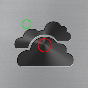
Hmm. Downloaded the .psd and I don't see that sort of conical gradient you're using. Maybe because I'm opening it in gimp and you're doing some fancy PS layer trickery Smile

As I look at it though, I don't think you'll retain the desired effect by doing what I suggested, which was to move the center of the conical gradient off to the side (from the red area to the green area.)

Image

I did play with the icon above and obscured that distinct point with a little blur and a very faint white burst at the center.

Image

Maybe something like that would work, just to take the edge off a little bit?
Reply
#19
Juanflaco Wrote:Hmm. Downloaded the .psd and I don't see that sort of conical gradient you're using. Maybe because I'm opening it in gimp and you're doing some fancy PS layer trickery Smile

As I look at it though, I don't think you'll retain the desired effect by doing what I suggested, which was to move the center of the conical gradient off to the side (from the red area to the green area.)

image removed

I did play with the icon above and obscured that distinct point with a little blur and a very faint white burst at the center.

image removed

Maybe something like that would work, just to take the edge off a little bit?

I see what you are saying, just remove the hard edges in the center. I will see what I can do, maybe use the Satin overlay or maybe a smudge effect.
Image
Reply
#20
New versions of .xbt file and .xml file in the first link:

Update 28-Jan:

Done:
  • Rescaled the Default Icons to display better at 1080
  • Change round corner reflections to square corners
  • Fixed spacing on Landscape and File frames
  • Replaced a few Default Icons with better versions
  • Moved angle gradient overlay on a few of the Default Icons

Still to do:

[INDENT]Color changes

No longer in scope:

Genre images will now remain as is.
Home Icons, some new ones are there but will be removed.
[/INDENT]


Please feel free to look it over and let me know where there are problems with the Theme.
Image
Reply
#21
Looking really nice, good job!
Reply
#22
I've been using this theme now almost exclusively and very happy with it Smile Two issues stand out though:

1) OSD background is too transparent
2) the Selected items in infolists are barely visible

I've fixed both issues for my own use by choosing lighter colors on the foreground of those items, so I think it would be great if you'll find a more aesthethically pleasing solution at some point. Anyway, I'm very happy with what you've accomplished so far.
Reply
#23
odt_x Wrote:I've been using this theme now almost exclusively and very happy with it Smile Two issues stand out though:

1) OSD background is too transparent
2) the Selected items in infolists are barely visible

I've fixed both issues for my own use by choosing lighter colors on the foreground of those items, so I think it would be great if you'll find a more aesthethically pleasing solution at some point. Anyway, I'm very happy with what you've accomplished so far.

Try the new version by re-downloading from the first post, I have fixed some of those issues and changed a few things. See the following post for version details.
Image
Reply
#24
New versions of .xbt file and .xml file in the first link:

Update 30-Jan:

Done:
  • Fixed spacing on a few frames
  • Replaced a few Default Icons with better versions
  • Darkend up the screen controls to show up better when playing CD's or movies in a window
  • Darkened up a few of the frames
  • Changed background.png to remove radial noise
  • Changes to OSD colors so that showing it does not significantly impact viewing
  • The few home icons were removed from the .xbt file

Still to do:

[INDENT]Final testing before submitting to Hitcher

No longer in scope:

Genre images will now remain as is.
Home Icons, you can always use your own in Alaska.Revisited settings.
[/INDENT]


Please feel free to look it over and let me know where there are problems with the Theme. By the way, according to translate.google caelatum is Latin for embossed.

Image
Reply
#25
@Juanflaco & other testers.

I am thinking about changing the default icons just a bit. The ones that are essentially round I will keep the gradient angle fill but others remove it and make them more flat. Here is an example, tell me what you think:

Filled vs. Unfilled:
Image Image
Image
Reply
#26
New Caelatum.xbt file linked in first post.

Update 01-Feb:

Done:
  • Movie Genre Icons NOW INCLUDED!

Still to do:

[INDENT]Final testing before submitting to Hitcher

No longer in scope:

Music genre images will now remain as is.
Home Icons, you can always use your own in Alaska.Revisited settings.
[/INDENT]

Please download and look over this theme to let me know if there are issues.
Image
Reply
#27
Wow. I need to check this out, looks awesome. Great work man.
Reply
#28
Probably being a moron. But I want those lovely icons you have on the home page however when I pick icon view they are large mostly white icons with really big text for 'tv shows' 'films' etc
Reply
#29
garyi Wrote:Probably being a moron. But I want those lovely icons you have on the home page however when I pick icon view they are large mostly white icons with really big text for 'tv shows' 'films' etc

Horizontal or vertical list view, not icon view.
Image
Reply
#30
Gotcha!
Reply

Logout Mark Read Team Forum Stats Members Help
[WIP] [THEME] Caelatum (Embossed Brushed Steel)0