+- Kodi Community Forum (https://forum.kodi.tv)
+-- Forum: Support (https://forum.kodi.tv/forumdisplay.php?fid=33)
+--- Forum: Skins Support (https://forum.kodi.tv/forumdisplay.php?fid=67)
+---- Forum: Aeon MQ (https://forum.kodi.tv/forumdisplay.php?fid=68)
+---- Thread: Change is coming... (/showthread.php?tid=48863)
- djh_ - 2009-04-18
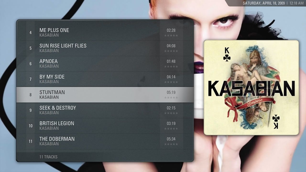
The stars look odd because they're downscaled from a much larger size. The problem is that you can only have one set of images for stars in XBMC, so there's little that can be done if have larger stars elsewhere. That new colour scheme was actually based on the fullscreen info page and the context menu - I see no reason why it can be extended to other new views.
- Nazgulled - 2009-04-18
The rows are much more darker than any other part of the skin, for instance, the button menu, the brightness and colors on both are very different.
- natew - 2009-04-18
Honestly, fanart with a view that covers that much screen looks almost like an excuse to not have to design a dedicated background.
- djh_ - 2009-04-18
Well, dedicated backdrops are easy. Doesn't mean you can't have custom artwork, though.

- djh_ - 2009-04-18
Nazgulled Wrote:The rows are much more darker than any other part of the skin, for instance, the button menu, the brightness and colors on both are very different.
Ah, I actually tweaked the button menu to match but didn't commit the change. That's all changing at some point anyway.
- natew - 2009-04-18
djh_ Wrote:Well, dedicated backdrops are easy. Doesn't mean you can't have custom artwork, though.
I guess that's true. Maybe an option like we have with the current wall view would be in order then?
edit: Actually, for music that looks pretty nice since the album art doesn't cover quite as much.
- Nazgulled - 2009-04-18
Yeah, I'm talking about the last version on GIT. That darker gray/aqua menu is not on the button/context menus on GIT, and I much prefer this new version you are showing and I like consistent things lol...
I don't think there's any more menus that would need to be matched. Maybe the whole settings dialog but maybe that's too much work...
Keep up the good work, it's looking very nice

- Nazgulled - 2009-04-18
natew Wrote:Honestly, fanart with a view that covers that much screen looks almost like an excuse to not have to design a dedicated background.Have you ever though there are some people that don't care/use fanart? I for one, couldn't care less of the fanart... I actually wish for a bigger menu to cover most of the screen and display more content...
- natew - 2009-04-18
Nazgulled Wrote:Have you ever though there are some people that don't care/use fanart? I for one, couldn't care less of the fanart... I actually wish for a bigger menu to cover most of the screen and display more content...
That's what I meant, actually. I indended that more as a request for disabling fanart altogether in this view rather than the other way.
- Drizz - 2009-04-18
Nazgulled Wrote:Have you ever though there are some people that don't care/use fanart? I for one, couldn't care less of the fanart... I actually wish for a bigger menu to cover most of the screen and display more content...
Dont like fanart?!

It's the best thing since sliced bread imho. Just my opinion of course, but I couldn't resist.
- djh_ - 2009-04-18
natew Wrote:That's what I meant, actually. I indended that more as a request for disabling fanart altogether in this view rather than the other way.
Don't worry. I understood what you meant.

- CF2009 - 2009-04-18
i would love to see it more like this, with out the shading & bar in the background...

- djh_ - 2009-04-18
I don't see why that shouldn't be an option. Not just yet, though.
- HexusOdy - 2009-04-18
I disagree. I think it look sbetter with the bar etc like the original.
In fact I think it should be implemented as list view in this last incarnation and left at that. The colour scheme and layout look spot on and at the end of the day you could probably design and redesign any view over and over and each would have people that love it and people that don't.
Although, none of these new images shows TV with Episode view. I'm not convinced about having the Episode thumb overlap the TV SHow thumb. Might be best just to do away with the TV poster and just have the EPisode thumb in TV mode.
- empty - 2009-04-18


Thats only a concept idea but something like that would be great!
 WideIcon support is a musthave I think
  . And yep I know there are a lot of mistakes.. but maybe someone is inspired